Clear Answers for Pressing Questions:
Improving the usability of the federal Telehealth website
Total time: 2 months (or 4 two-week sprints)
The federal Telehealth website launched as a response to Covid-19 pandemic to provide medical practitioners and patients with best practices for how to navigate the increased demand for telemedicine. I was brought into the site’s operations team in September of 2022, where I designed, pitched, and executed 13 qualitative UX research studies to help designers and developers understand user needs and patterns, while also testing design prototypes and refining issues uncovered through the monitoring of site analytics. The insights I produced were essential to the redesign of event calendars, best practice guides, and research archives, but my most impactful contribution was helping redesign the information architecture for the site’s patient-facing content.
In short, over a period of four months I:
Used site analytics to pinpoint a possible issue: high user bounce rates and low clickthrough rates
Planned a cross-functional solutioning workshop to frame the issue and develop hypotheses: content presentation mismatch with SEO and paid advertising
Designed a research study, in both English and Spanish, to test the hypothesis and generate design insights: In-depth interviews followed by a live usability exercise
Worked with design and content teams to develop a prototype to resolve the issue: Changed site architecture and content presentation to match common search queries
Designed a usability study to evaluate the prototype: Users were consistently better able to find the information they were looking for on the redesigned prototype.
Presented, gained approval, and released: Presented results and reassured stakeholders on the redesign plan, captured risks, and eased their anxiety about continued site growth.
Reading the signs. [1 weeks]
Step 1
At the start of my time in the project, I partnered with our analytics team to set performance benchmarks for our site. We quickly noticed that our content aimed at patients had an abnormally high bounce rate and low click-through rate. We also discovered that the majority of the traffic coming to those pages came from search engine queries, not from the site’s homepage.
Step 2
I set out to better understand and provide a solution to this phenomenon. I planned a cross-functional solutioning workshop and invited teammates from design, content, development, and marketing SMEs. This collaborative approach helped me gain early buy-in and partnership from cross-functional teams, while leveraging their expertise to understand the product. Together, we landed on three distinct hypotheses that could help explain and solve the issue:
1. A misalignment between the paid marketing that brought users to the site and the content they encountered.
2. A change in user needs since the start of the pandemic that no longer reflected the content produced for the site.
3. Issues with content presentation that made it difficult for users to find what they were looking for on the website.
With a quantitative benchmark for site performance, and a cross-functional hypothesis for the issue at hand, I designed a qualitative study with two parts: First, In-depth interviews to help us refine our changing user-personas and their drives, and second, usability tasks to refine our user journeys and uncover painpoints that could explain the abnormally high bounce rate and low clickthrough rate.
Refining the problem. [3 weeks]
Step 3
Recruitment and Interviews
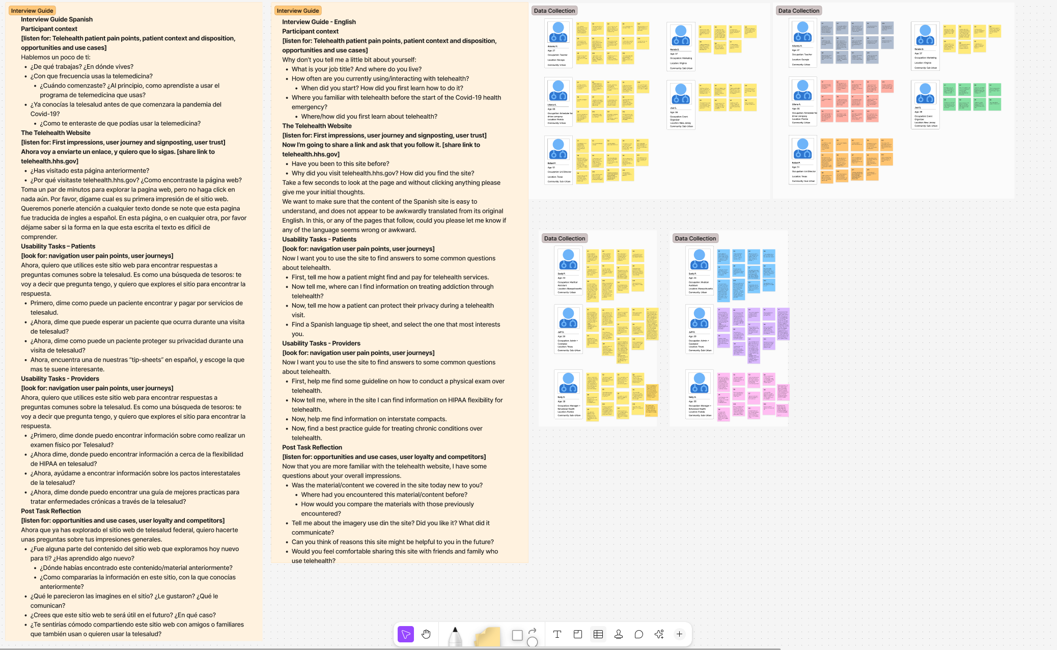
For this qualitative user study, I developed a recruitment guide that targeted a key site demographic drawn from analytics and marketing: patients aged 65+ with moderate to low experience using telehealth, in states that matched our targeted advertisement campaigns. I used that recruitment guide and userlytics.com to schedule 9 user testing sessions (in order to meet federal OMB standards). I developed a structured interview guide that aimed to uncover how everyday users would phrase search queries related to Telehealth access in search engines, and how they evaluated whether the results matched their questions, first in the browser, and then on the target site. The 60 minute interview sessions began with a set of questions about their changing relationship to the covid-19 pandemic and telemedicine, how their concerns had changed since 2020, and what they found difficult about using telemedicine.
It was then followed by a practical usability exercise, where I tasked users to perform search queries derived from a pool of common concerns with answers found on our site. Users discussed out-loud how they phrased their queries, evaluated the results, and made a decision amongst available options. Users were then provided a link to the federal telehealth webpage with an answer to their question, and were tasked with finding their answer.
Analysis
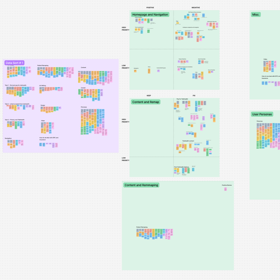
Using Figjam’s collaborative whiteboarding, I coded the interview transcripts and relevant observations of user behavior, clustered results, and charted them by their relationship to the study’s original hypothesis.
I reviewed the results with stakeholders from design, content, development, and marketing SMEs, asking those who had attended interview sessions to share their experience. Together, we discussed the draft insights, gaining alignment on possible solutions.
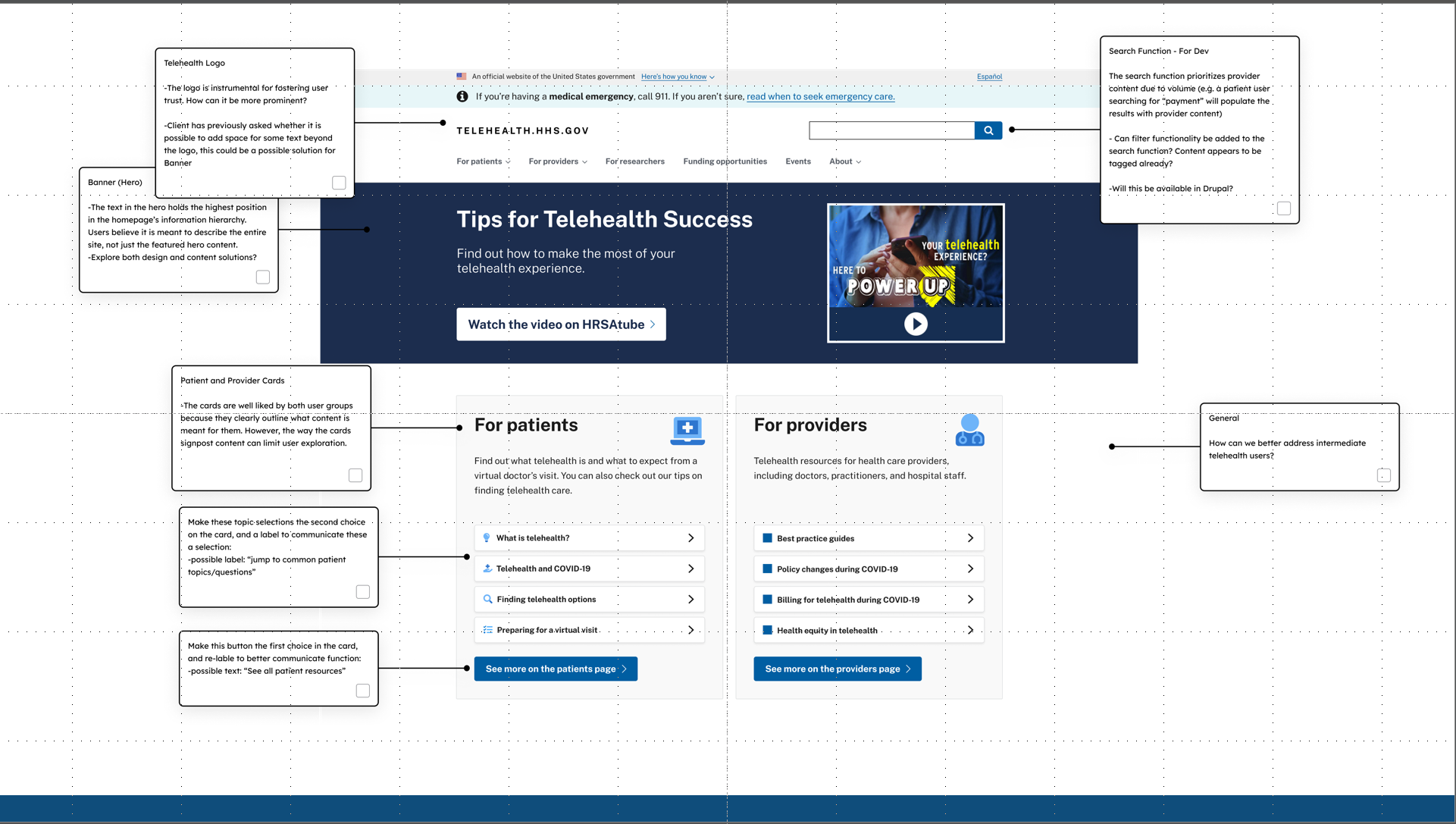
The data collected in the study was clearly aligned with hypothesis 3. The way users asked questions on their search engine did not immediately match how the federal telehealth website presented its content. When a user arrived at the site with a concrete question, and was met with a wall of information not formatted as an answer, the user was likely to bounce out of the site and pursue an answer elsewhere.
Even when the correct information was present on the page, if not presented to the user in a quickly recognizable format that matched their expectation, the user would not spend time on the site.
Prototyping. [2 weeks]
Step 4
With these answers at hand, the design and content teams began prototyping how site hierarchy and content presentation might change to more directly match the questions our users were asking.
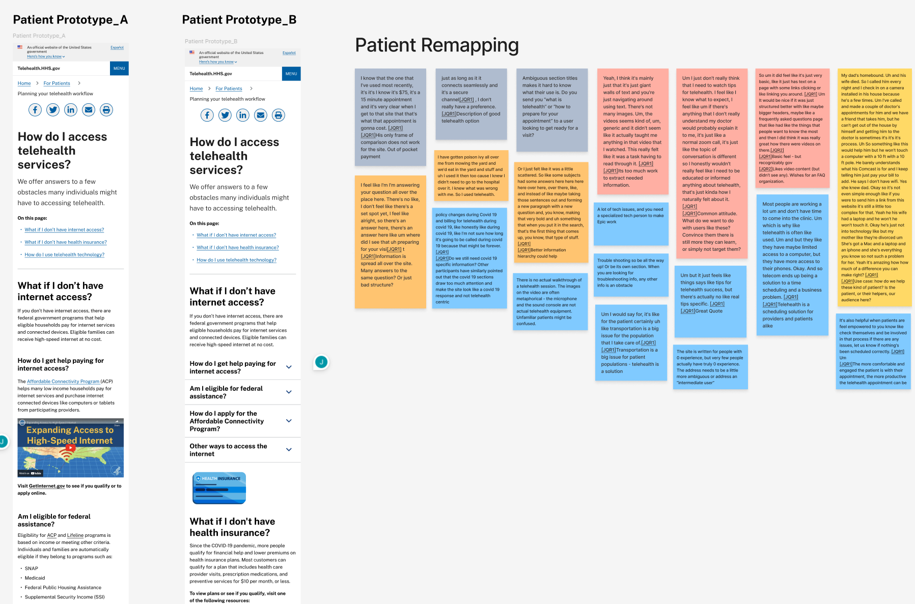
I worked closely with the design and content teams to break up the existing clusters of information and format them as smaller, more actionable chunks that more readily matched the search queries that brought users to our site. Based on research insights, our goal was for users to find a clear answer to a single question when they arrive to our site from a web browser. But, we also wanted our users to remain on the site. We used the journey maps developed from our interviews to anticipate what additional questions a users might have in their journey from feeling ill, to booking an appointment, troubleshooting their technology, receiving care, and finally paying for it.
We broke up the content of 5 pages into 9 key pages and additional resources. Those were formatted in an FAQ style, each question in an individual page, but linked through a pagination tool that allowed users to navigate across the pages like one continuous guide. The user journey was clearly displayed in the side navigation menu, clearly demarcating where a user was in the journey, and what they would find ahead.
Evaluation and presentation. [2 weeks]
Step 5
With a prototype of the site’s redesigned content, I designed an additional research study to test if the new content format was more likely to respond to the user’s exigence, and to uncover any additional usability issues that the team might have overlooked. Using the same recruitment guide, I scheduled interviews through userlytics.com with 9 new users, following the same format as our previous study: first an interview, followed by a usability exercise. I invited members of the design, content, and development teams as observers in the interview sessions, as well as recorded and transcribed all user interactions. Using Figjam’s collaborative whiteboaldding, I coded the interview transcripts and relevant user actions, clustered results, and this time, charted them in comparison to responses from the previous study.
We found users were not only able to find answers to their questions much more quickly, but also had a better understanding of what other content they could find on the site.
Step 6
I presented these findings to our government partners, framed as the story of a single user who needed to understand if their insurance would cover their telehealth appointment. With an approval from the client, the re-design went into production.